Ebola Case Fatality Rates
Portfolio > Bespoke eLearning, Articulate Guru Award Honourable Mention Winning Entry

Project Overview
Client: Internal project
Project type: eLearning
Authoring tool: Articulate Storyline
Our input: Design and Build.
Project Description
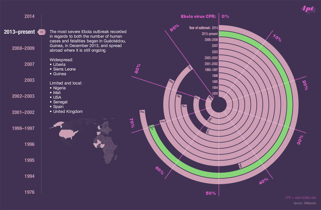
This Articulate Guru Honourable Mention-winning example helps learners understand the deadly effects of the Ebola virus. Adjusting the slider makes it easy for learners to understand how Ebola fatality rates changed over time.


Animation
At the outset we wanted the interactive chart to be visually appealing. We were delighted with how well Storyline’s built-in animation effects worked for the rings on the initial build animation. For something so simple, it really grabs your attention and makes you want to explore the data.
Feedback we’ve had on our interactive infographic
This is absolutely phenomenal!!! I remember seeing your first post and was totally gobsmacked at how awesome it looked and felt while interacting with it.
Wow, this is a splendid example of elegant design! I love how you took that data and gave it a simple, yet effective visual. And that colour palette is spot on.
Love what you did here on so many levels. Elegant, informative, and wonderfully interactive.

